My client, Cyndi Garavaglia, came to me to develop a full brand identity for her new Chicago-based restaurant, Sole Italian Café. The deliverables included a custom logo, business cards, loyalty cards, menu design, coffee cup and food packaging, aprons, and a large decorative window design placed just outside the restaurant’s kitchen.
Inspired by the meaning of “sole” (Italian for sun), I created a warm, modern brand identity rooted in comfort, craft, and quality. The color palette includes an inviting orange and organic green color to reflect the café’s homemade offerings. For the logo, I incorporated spaghetti and girasole pasta — the latter meaning sunflower, and shaped like the sun — tying directly to the café’s name and message: “A warm touch for the "Sole.”
I used elbow pasta as a visual metaphor for “elbow grease,” representing the owner’s hard work and passion. This motif appears on both the business card and the decorative window to honor the hands-on effort behind the café.
The loyalty card features a clean front and a playful back with a girasole stamp system for each visit. The sunflower-shaped pasta from the logo was also incorporated into one of the coffee cup designs, creating a subtle but cohesive brand connection across touchpoints.
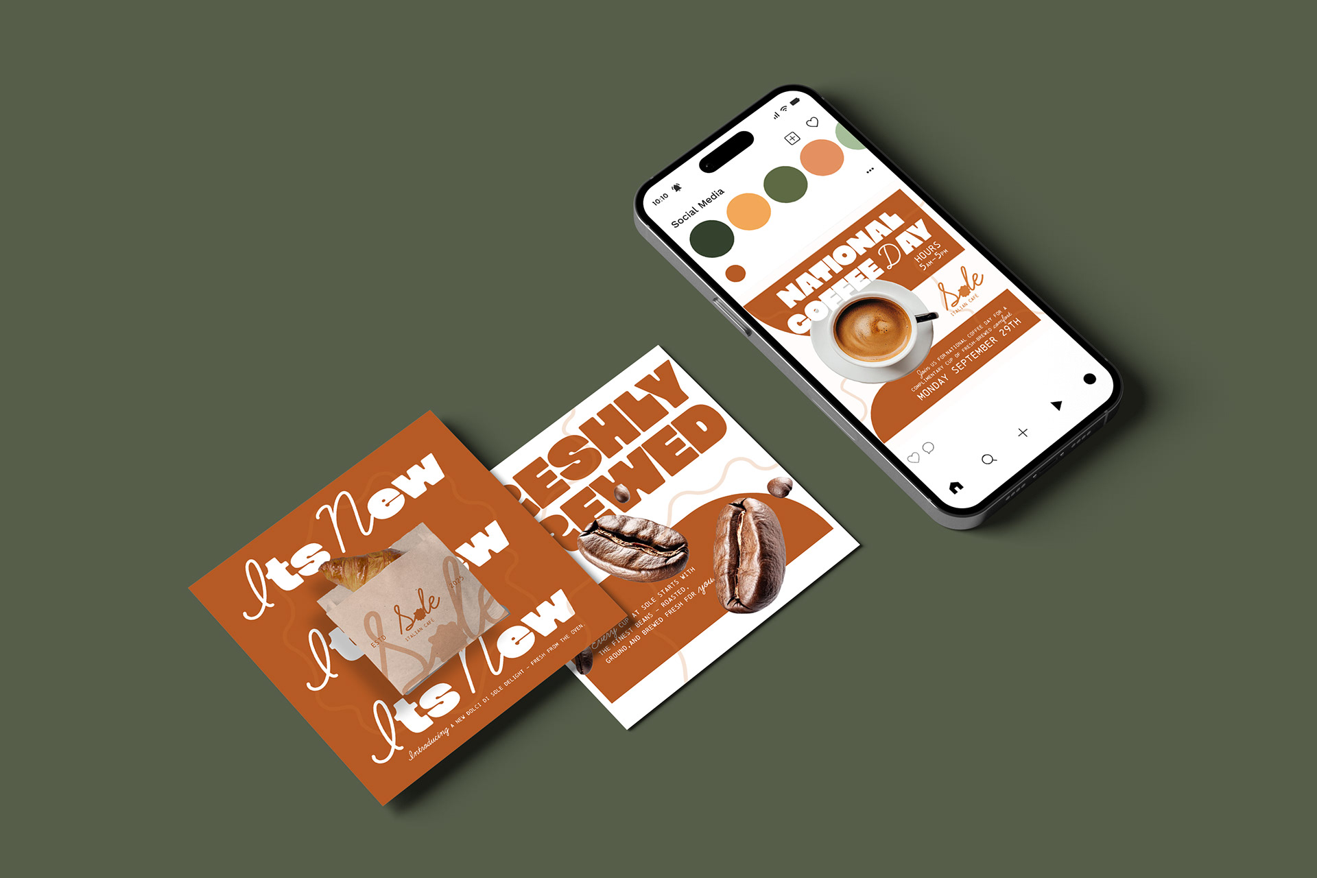
To promote the new identity, I designed three social media posts: one highlighting a new croissant item in Sole’s to-go packaging, another emphasizing freshly brewed coffee using coffee bean visuals, and a third celebrating National Coffee Day with a free drink offer. Each post showcases the warmth and elegance of Sole’s atmosphere while celebrating its modern Italian roots.
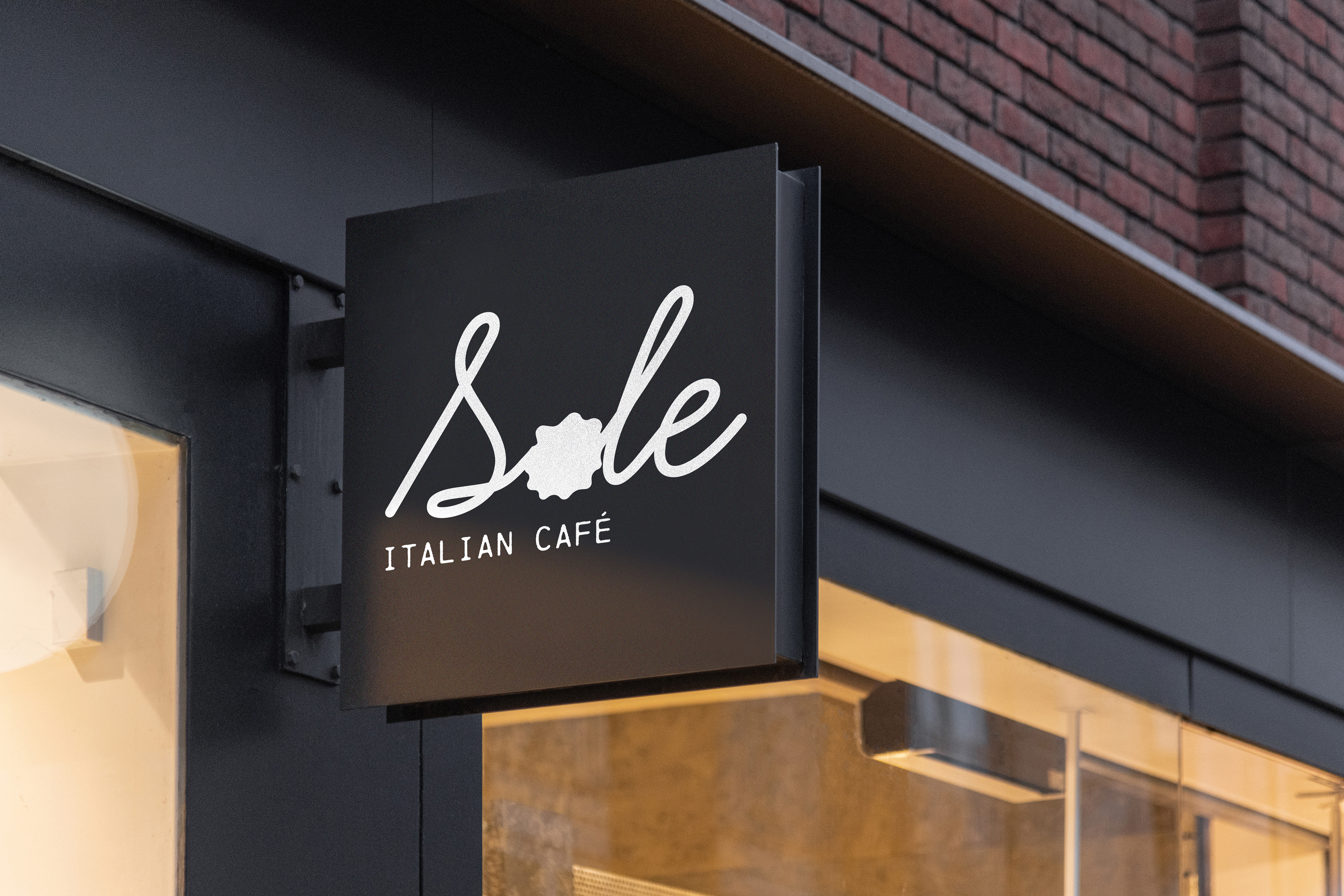
Sole Signage
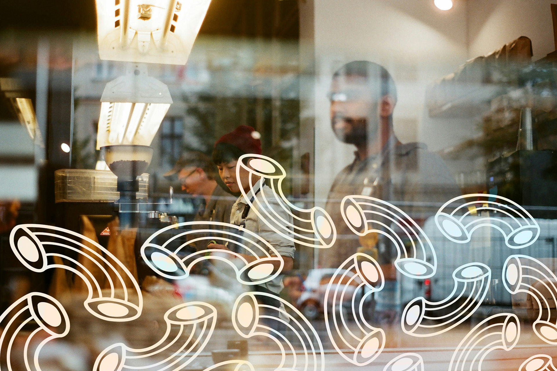
Sole Window Design
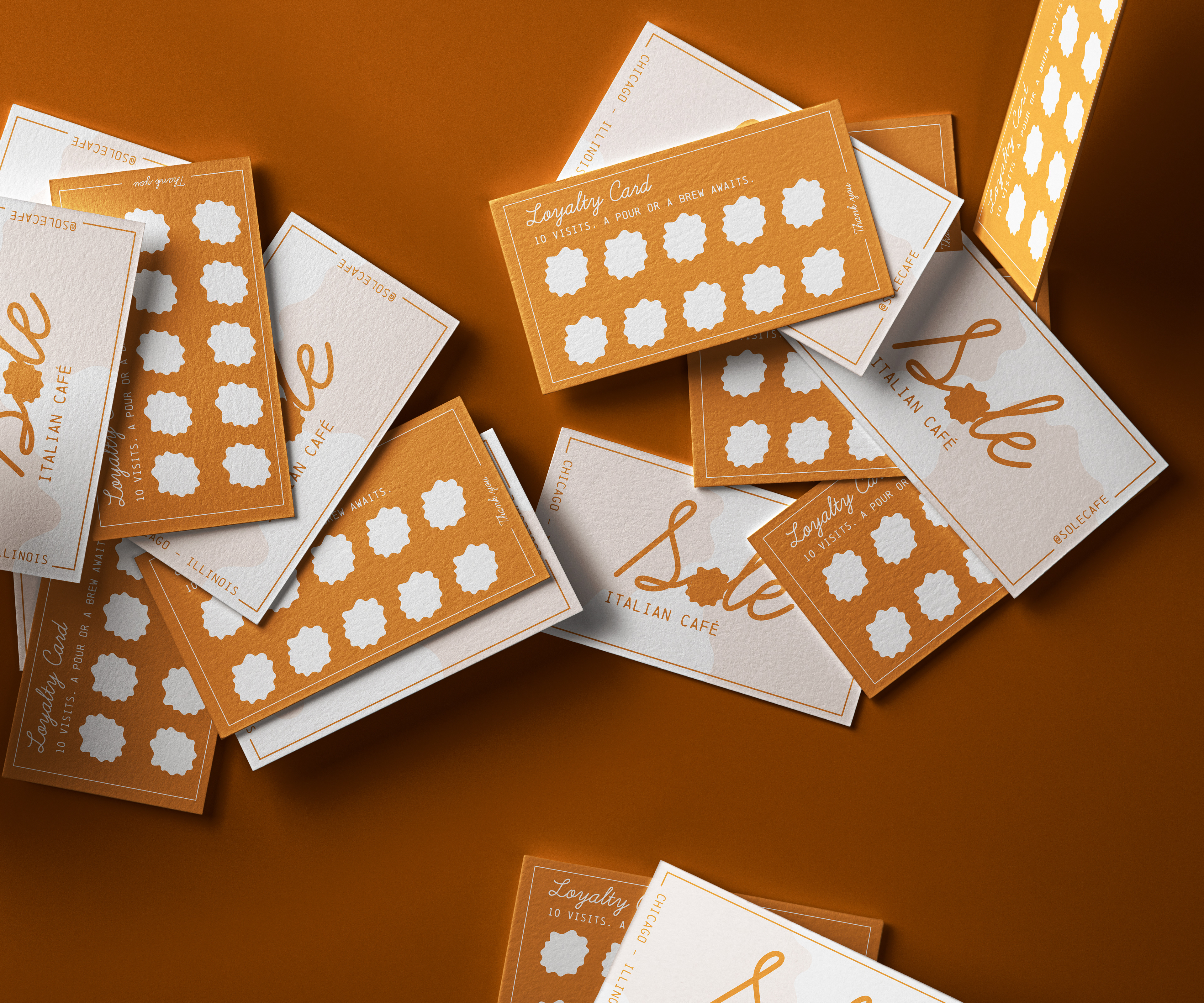
Loyalty Cards
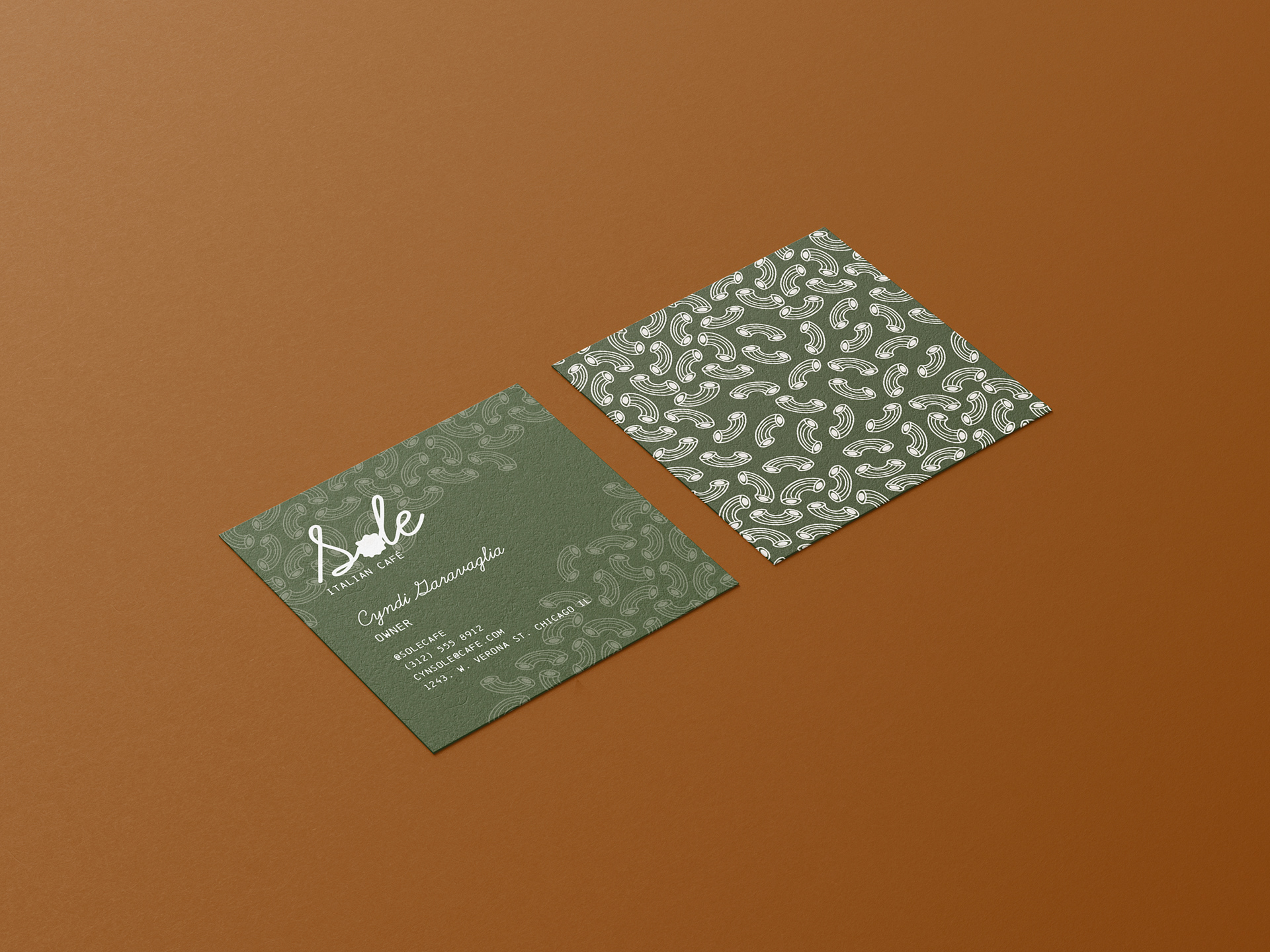
Business Cards
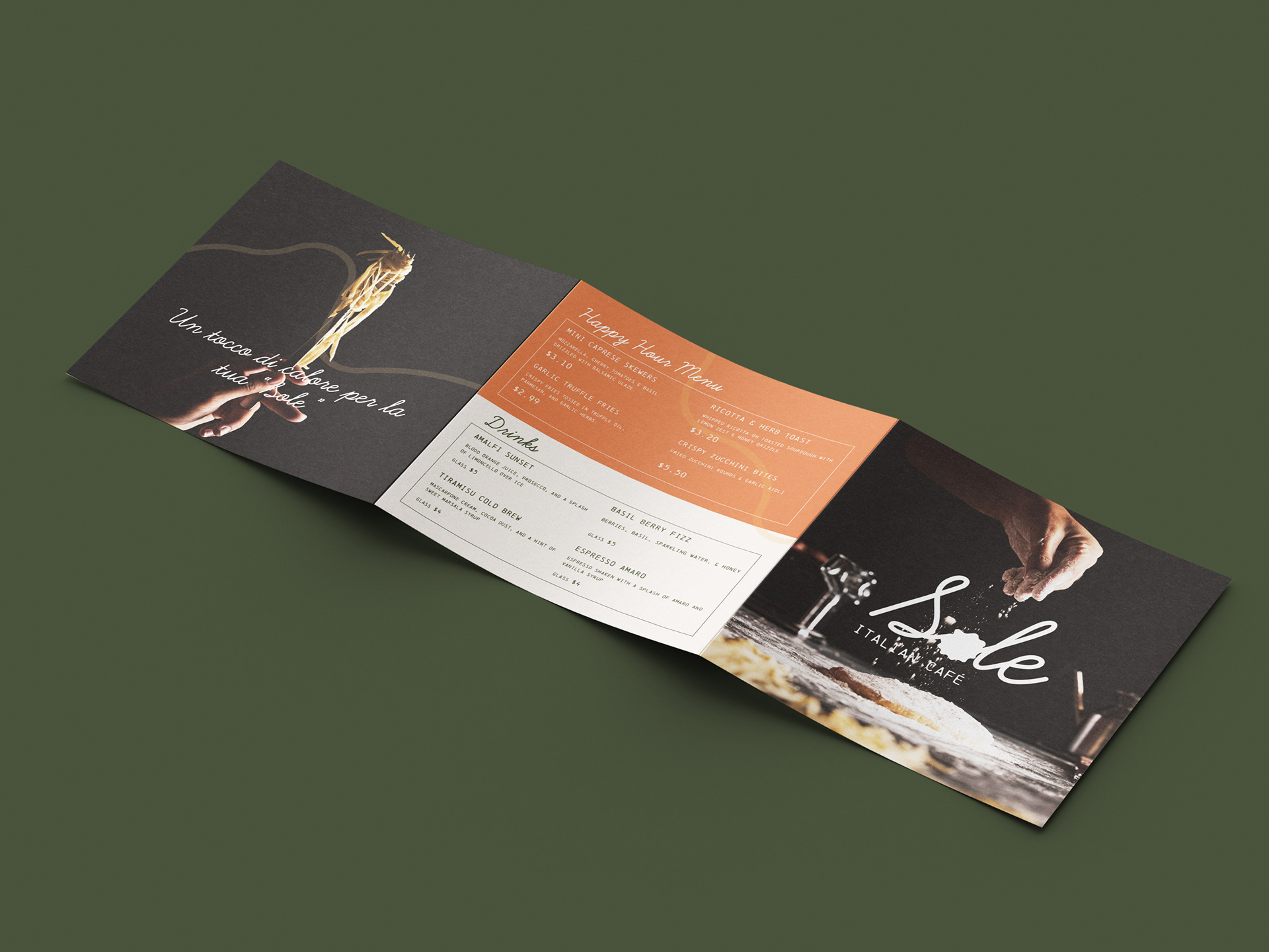
Back of trim-fold menu
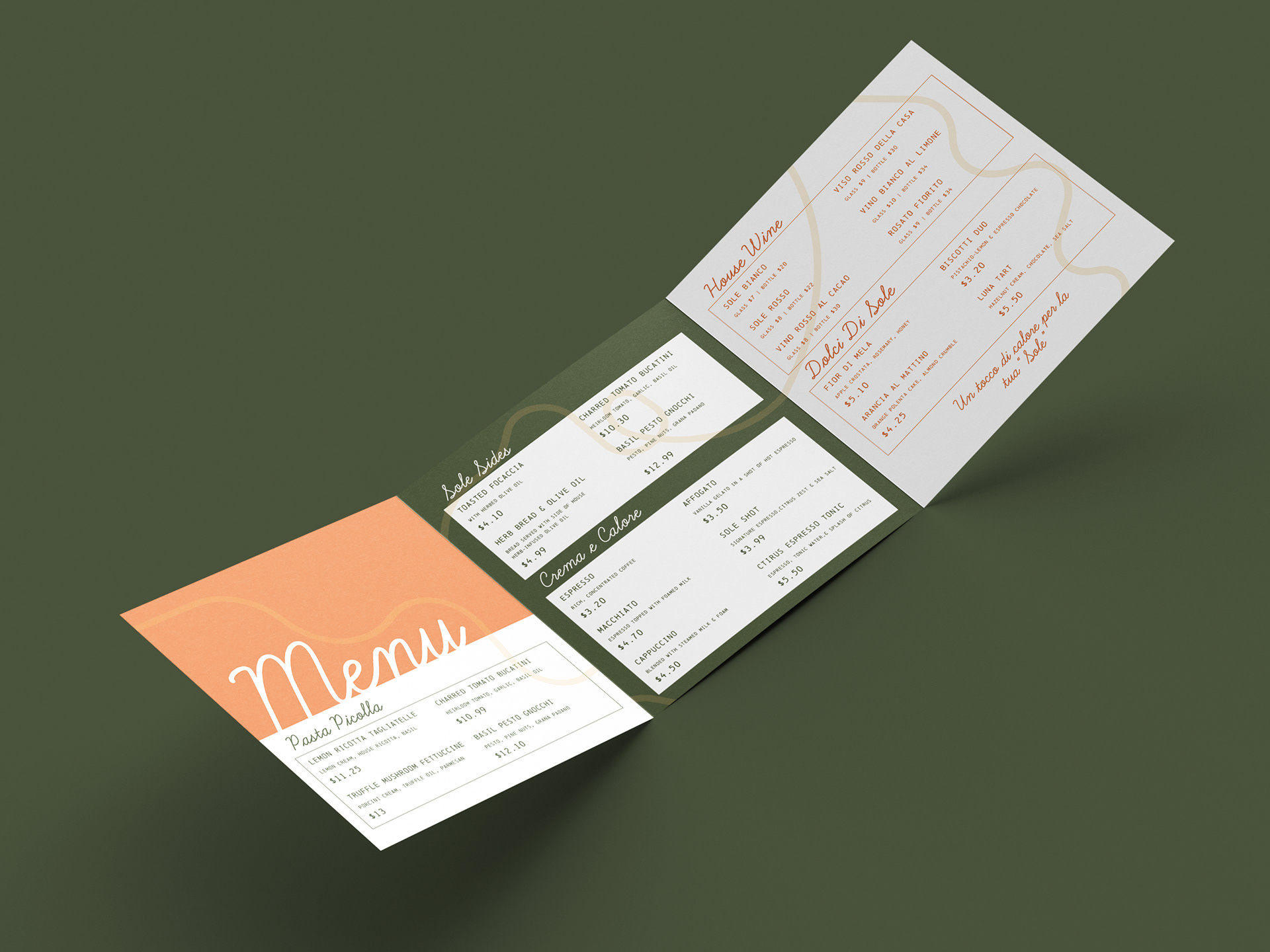
Inside of trim-fold menu
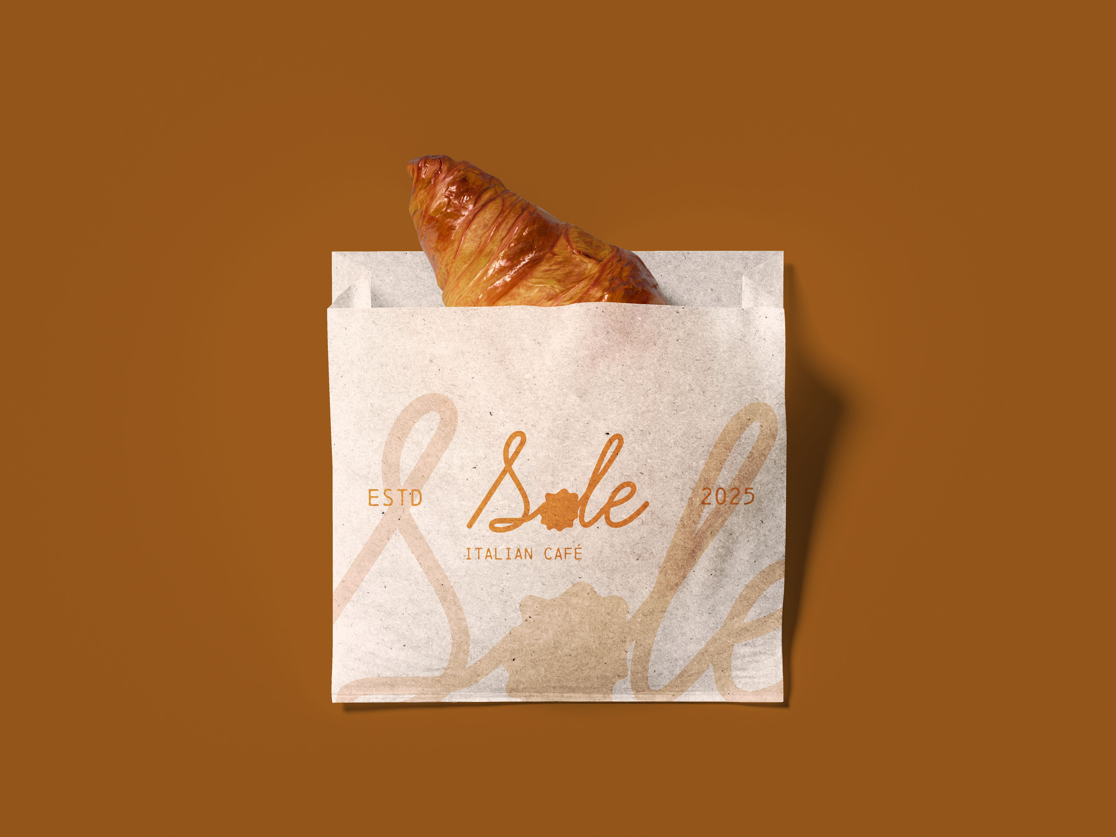
Food packaging
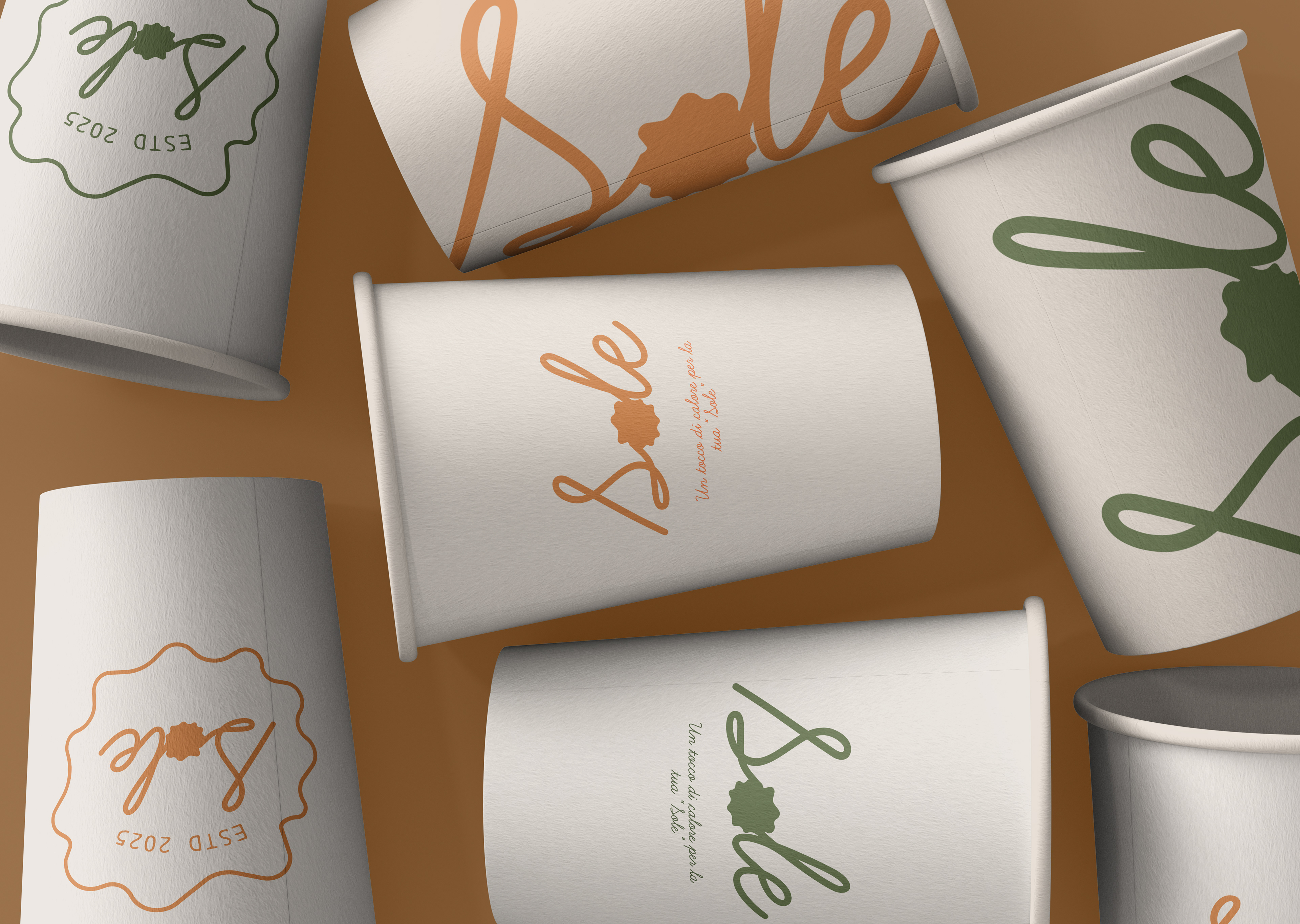
Cup Design
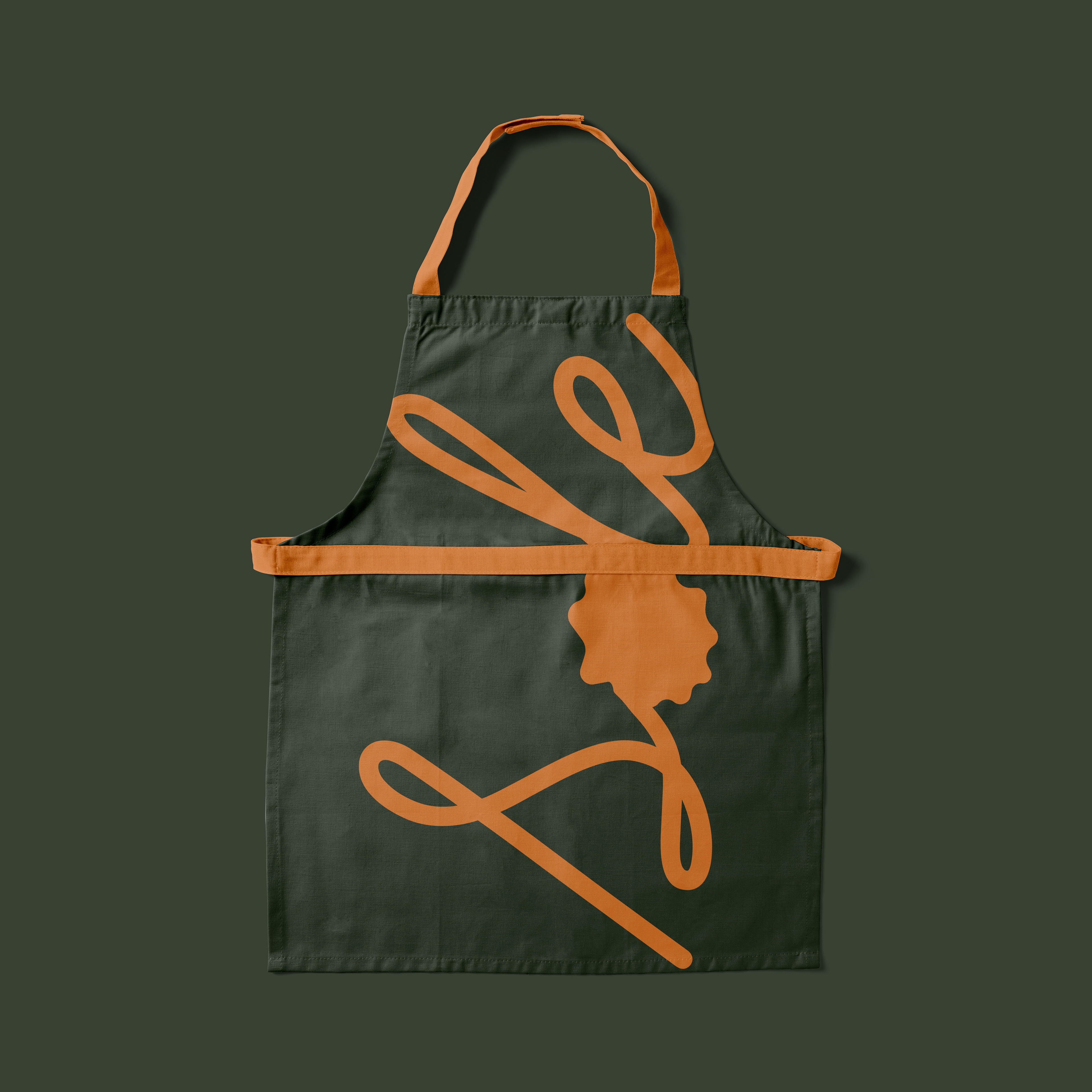
Apron Design
