
This design challenge consisted of creating three type posters of three different typefaces, "Didot", "Fraktur", and "Palatino", as requested by my client, a typography Enthusiasts. My client has a strong appreciation for the aesthetic qualities and history of fonts, as well as the technical details like kerning, line spacing, and font anatomy. With this in mind, I focused on highlighting each typeface’s background, including the year it was created, designer, classification, and a range of letter sizes showing both uppercase and lowercase in alphabetical order. I kept the layout consistent across all three posters, ensuring that each of the typefaces names were the hierarchy of the poster. The results are not only visually engaging but also serves as an effective way for my client to learn and appreciate the history behind these preferred typefaces.
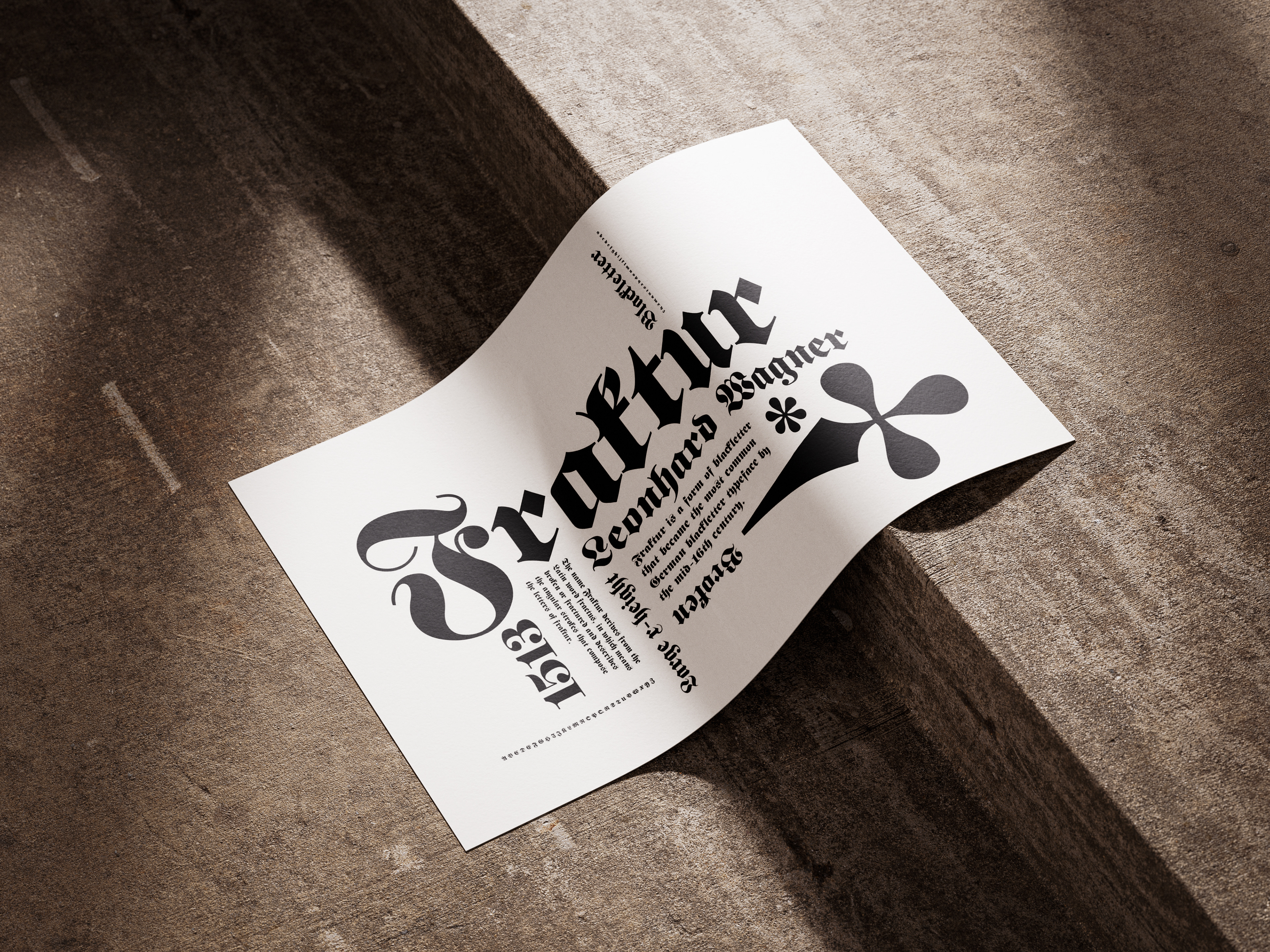
Fraktur Type Poster
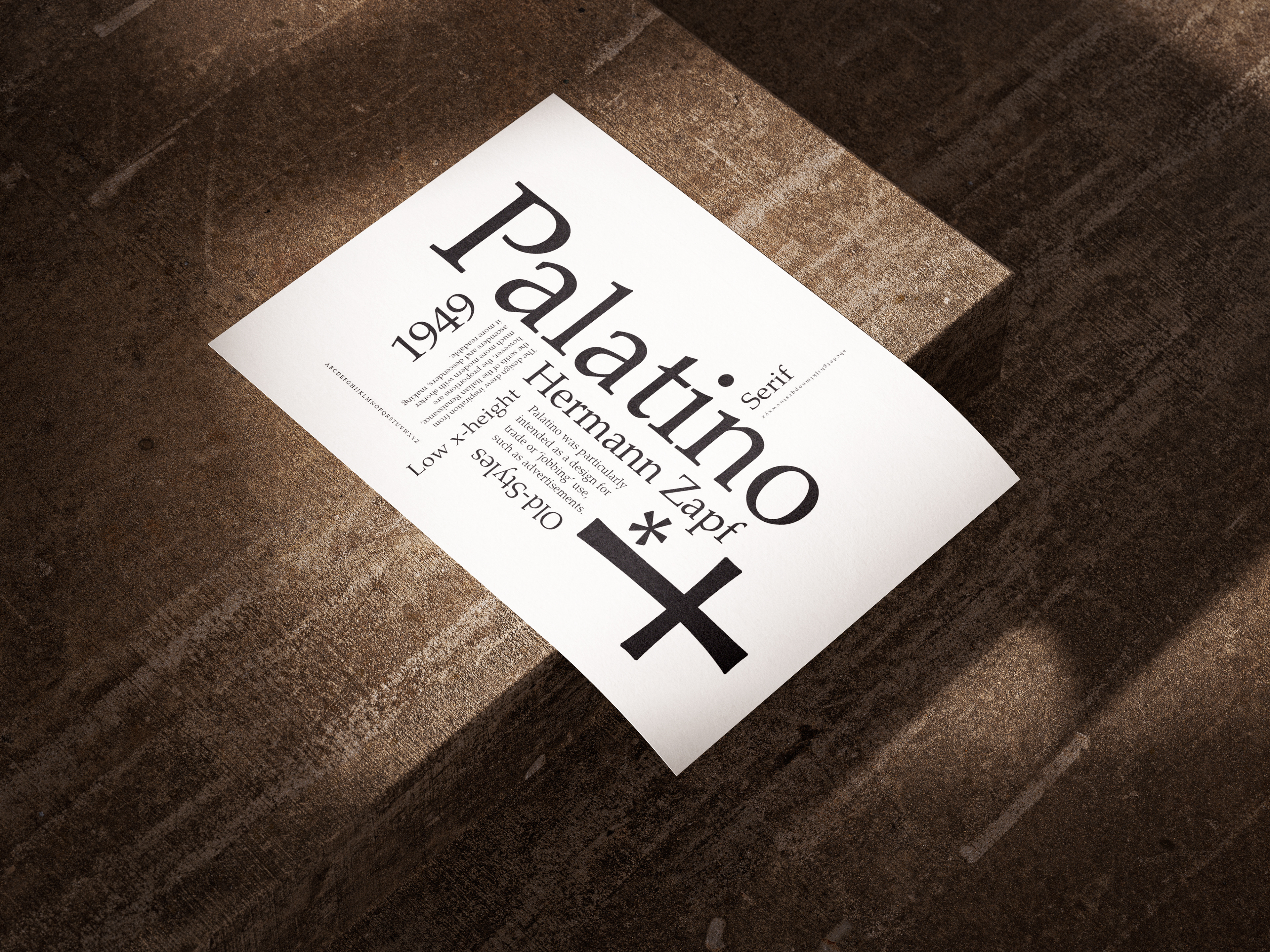
Palatino Type Poster