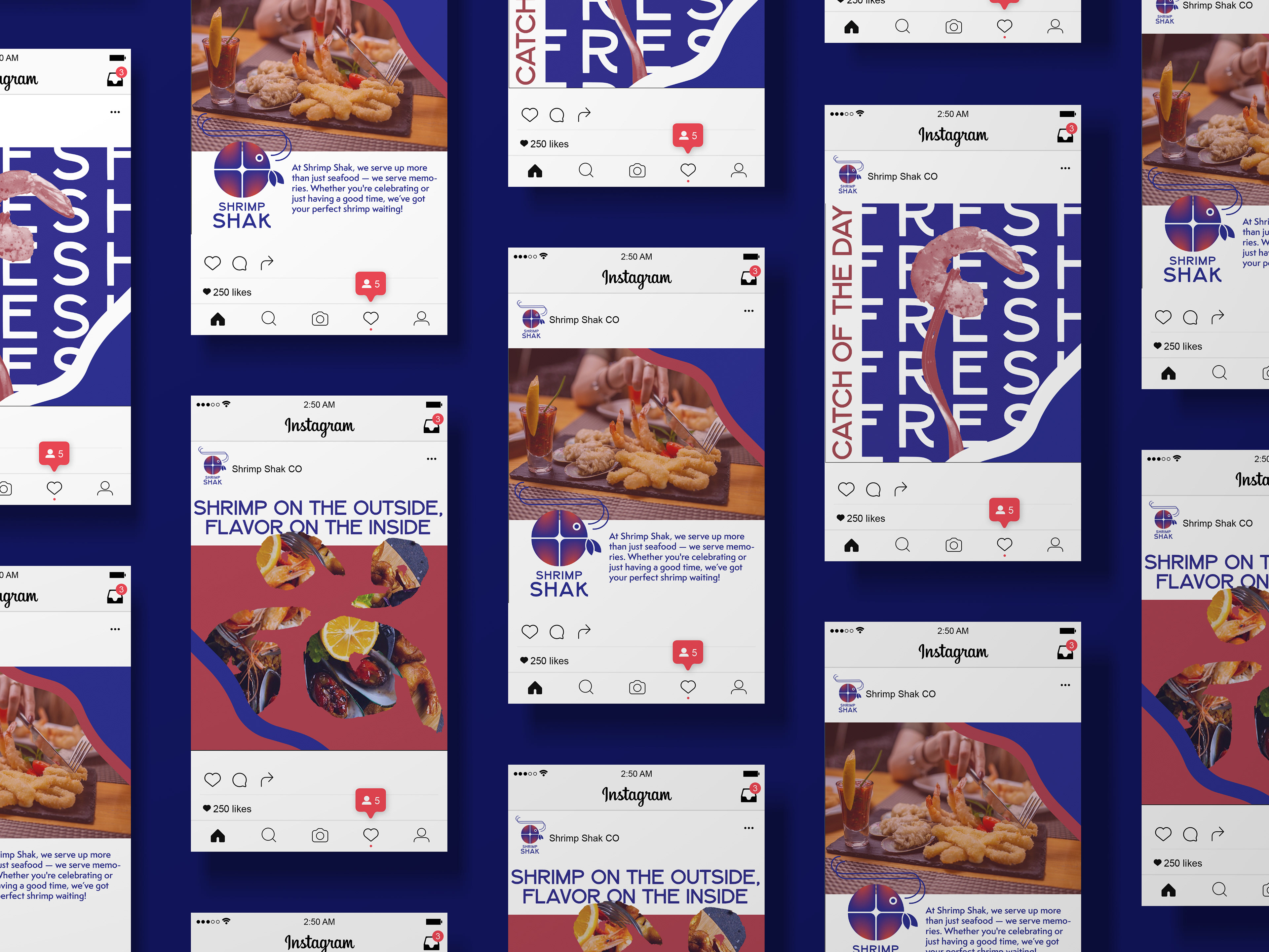
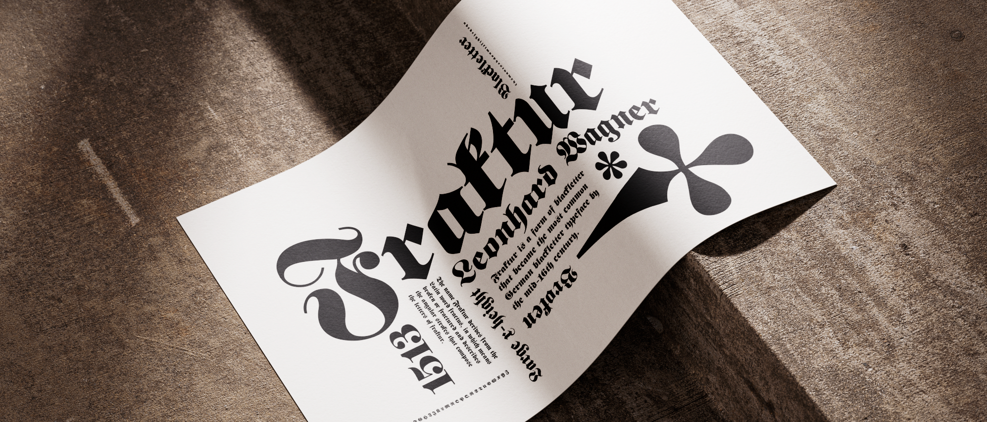
My client, Wendy Trout, approached me for a rebrand of her restaurant, Shrimp Shak. She envisioned something bold, unique, and eye-catching. To capture this, I created a geometric logo featuring a circular shrimp form. Instead of the expected red, I chose a vibrant blue—symbolizing freshness and uniqueness since it is harder to find. Standing out to the target audience, while red served as a secondary color to create balance and reference the shrimp’s natural hue.
The circular geometric mark was carried through the rest of the branding to establish consistency and reinforce recognition. Together, these elements express the bright, bold energy of Shrimp Shak and reflect the lively dining experience the restaurant offers its customers.
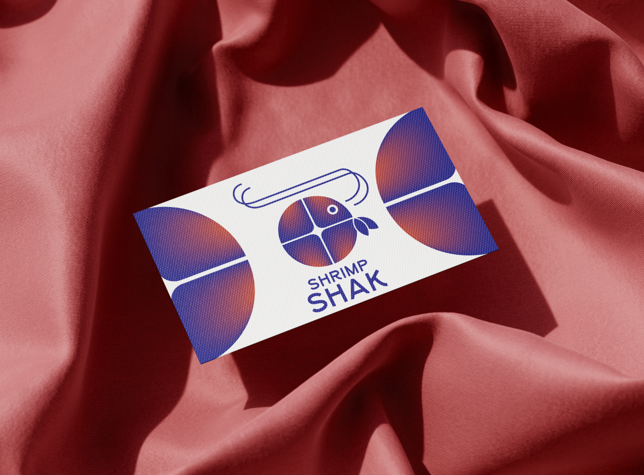
Front of Business Card
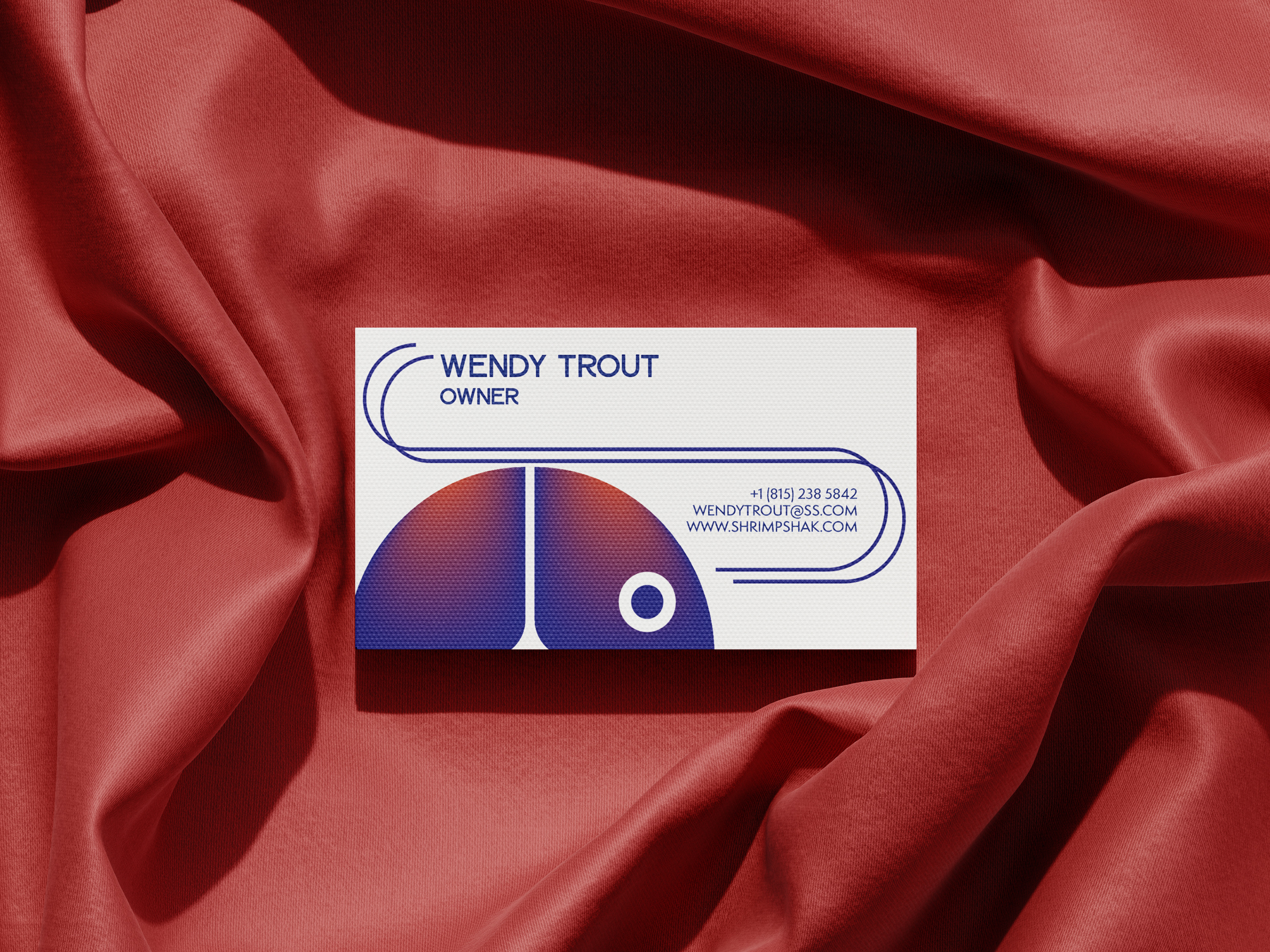
Back of Business Card
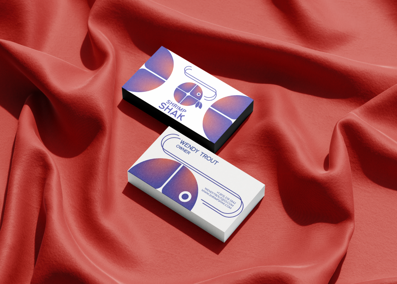
Front and Back of business card

back of Menu
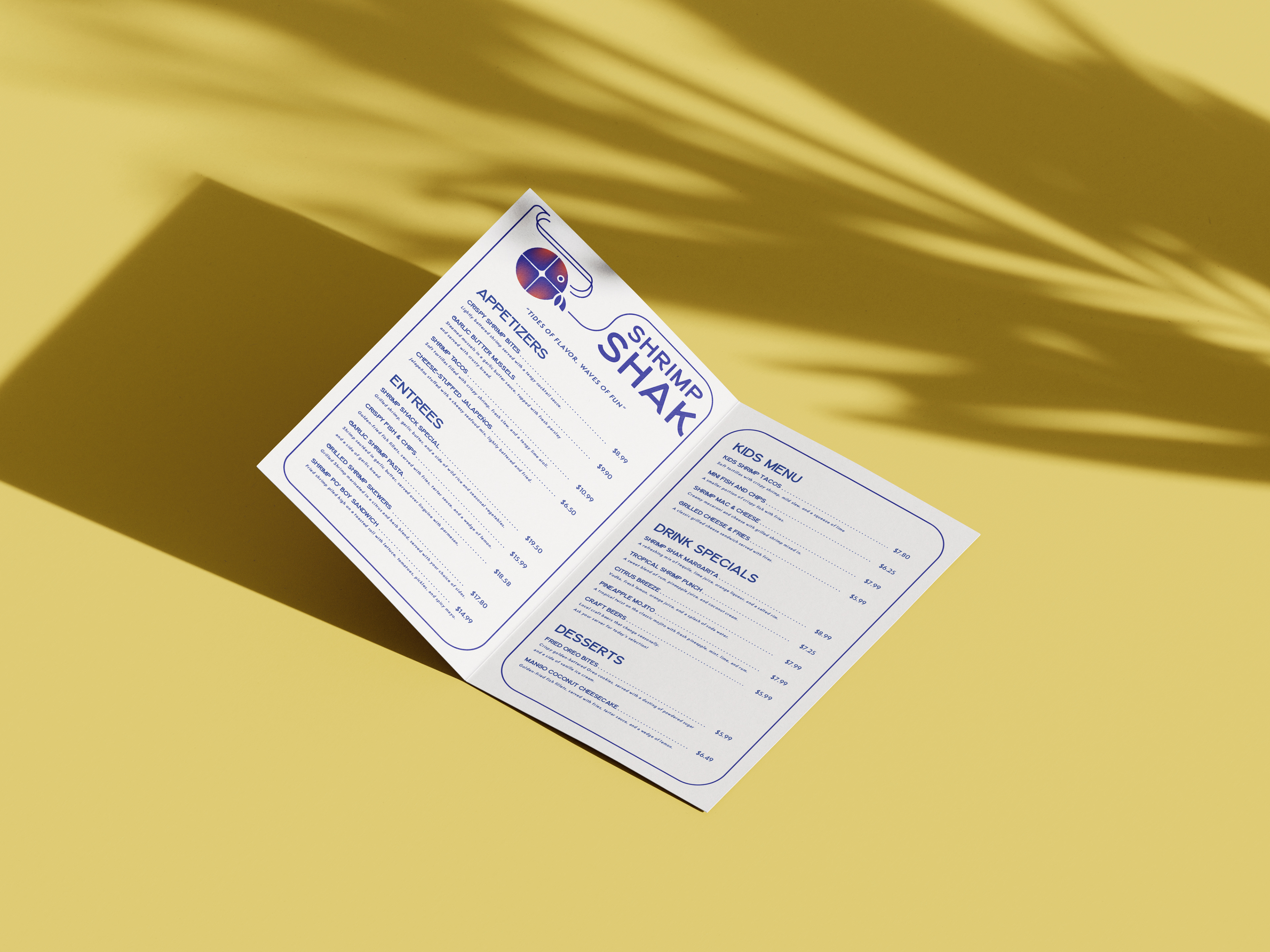
Inside Menu

Take-out Bag design

Take-out Bag Design
