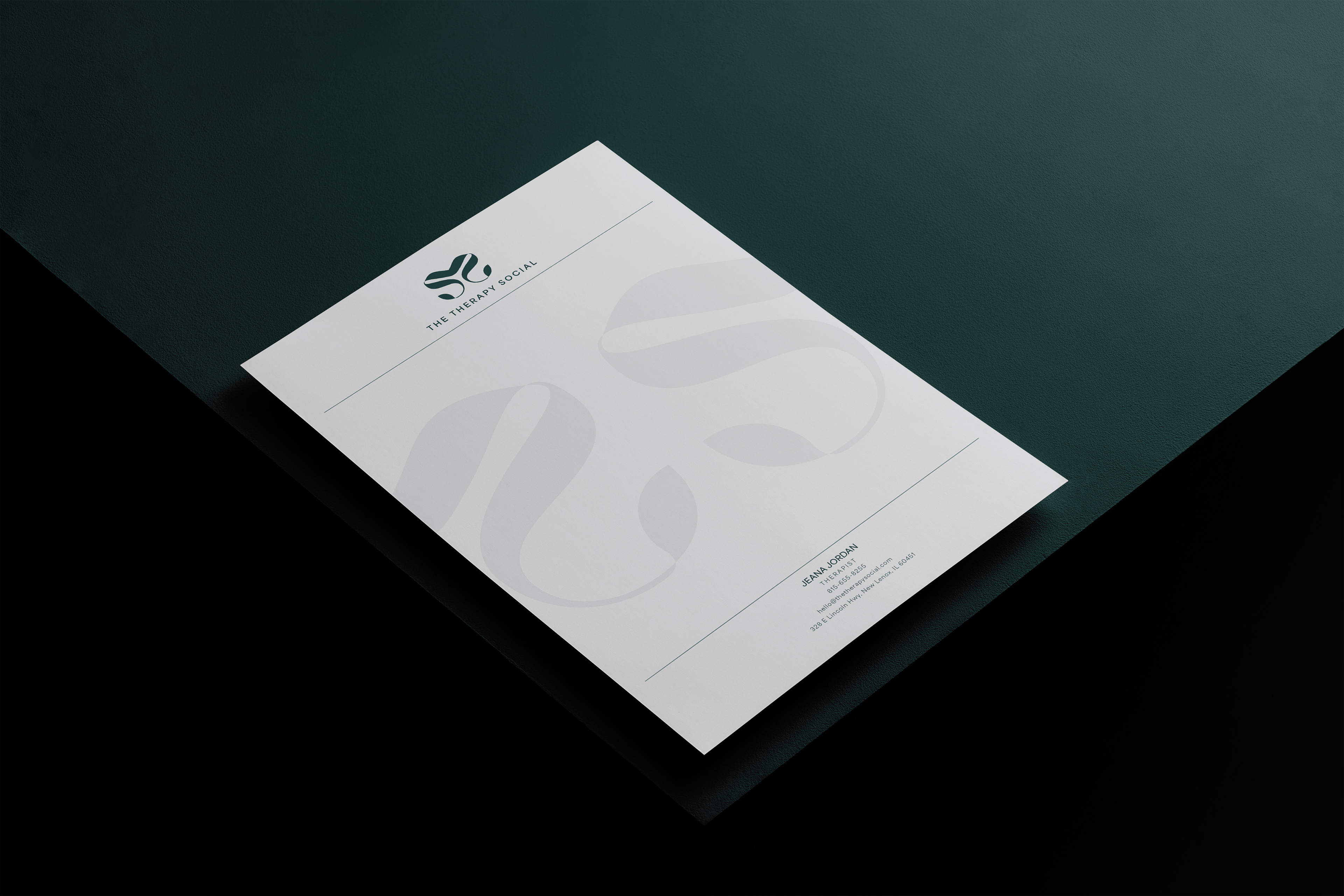

Jeana Jordan, a therapist from The Therapy Social, approached me to create a new visual identity for her upcoming venture. She envisioned a neutral, calming aesthetic with a grounded color palette. To bring this to life, I designed an organic-shaped logo inspired by the word “social” in her business name. The mark connects two “S” shapes to symbolize connection and support—core elements of the therapeutic relationship. The ends of each “S” subtly resemble leaves, adding a natural, growth-oriented feel to the logo. This detail reflects the ideas of healing, progress, and personal development that are central to Jeana’s work.
To complement this, I selected Area Normal, a clean sans-serif typeface that offers a modern, sleek, and minimal look. It reinforces the brand’s approachable and professional tone with clarity and simplicity.
From the color palette Jeana shared, I chose the shade Pine—a deep greenish-blue that evokes calm, balance, and emotional depth. It reflects the grounding, healing nature of therapy and helps create an environment where clients can feel safe, supported, and open to meaningful reflection. Together, the visual elements communicate connection, trust, growth, and a strong foundation for healing.
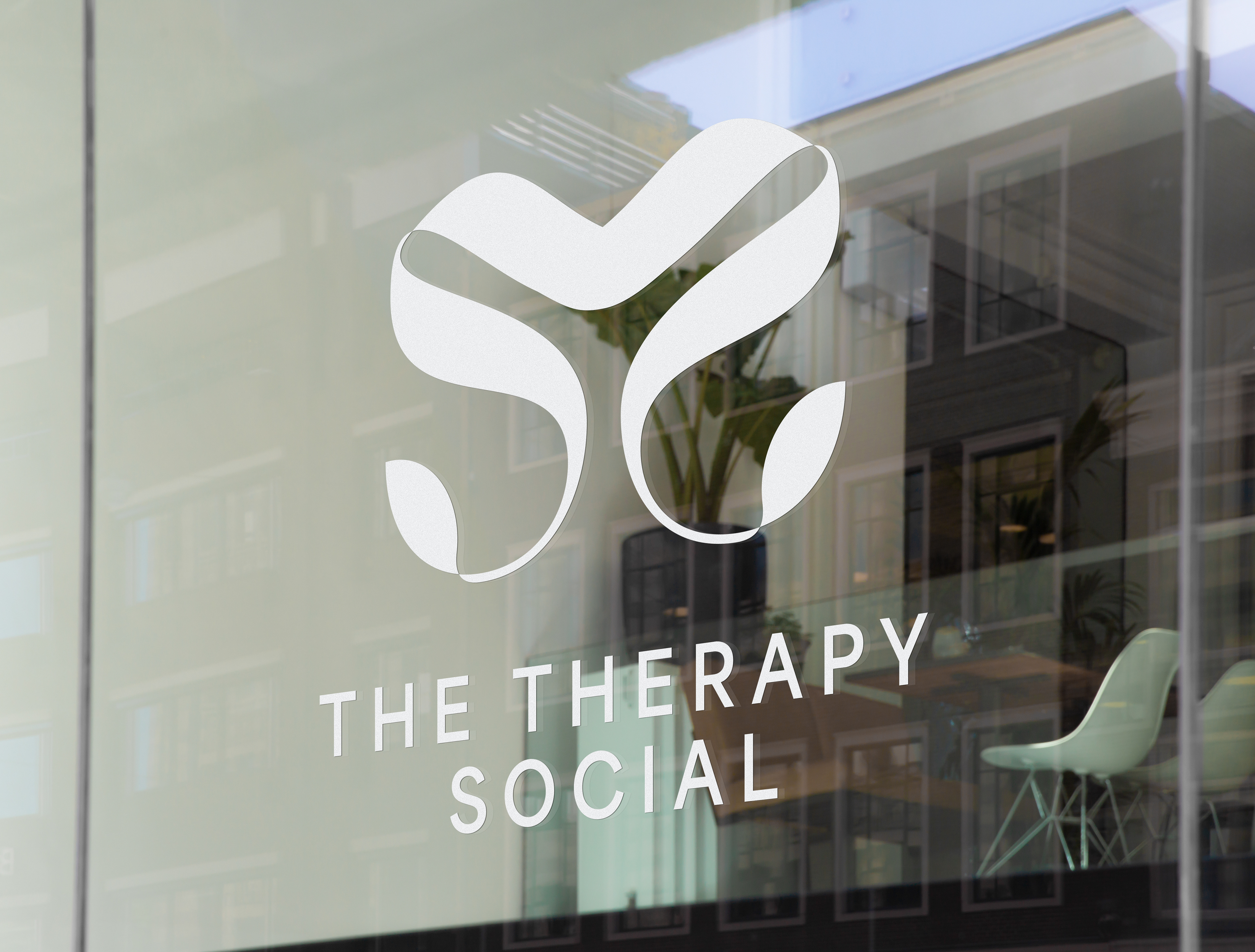
The Therapy Social Window Signage
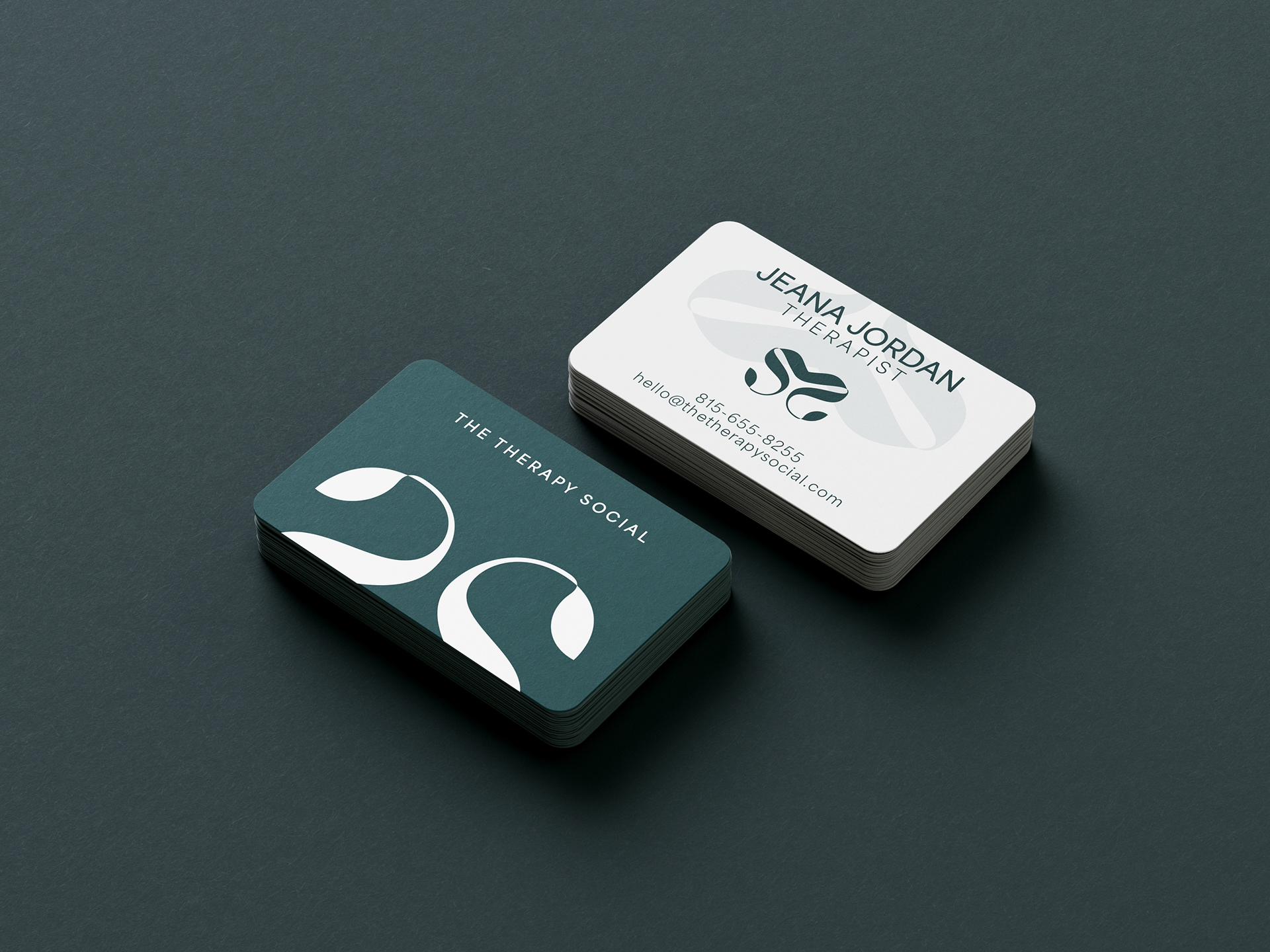
Front and Back of the business card
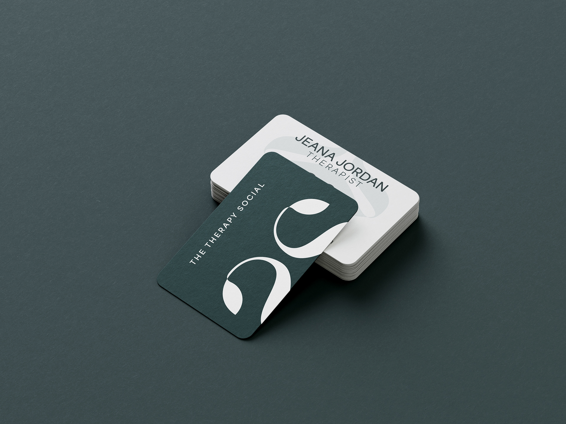
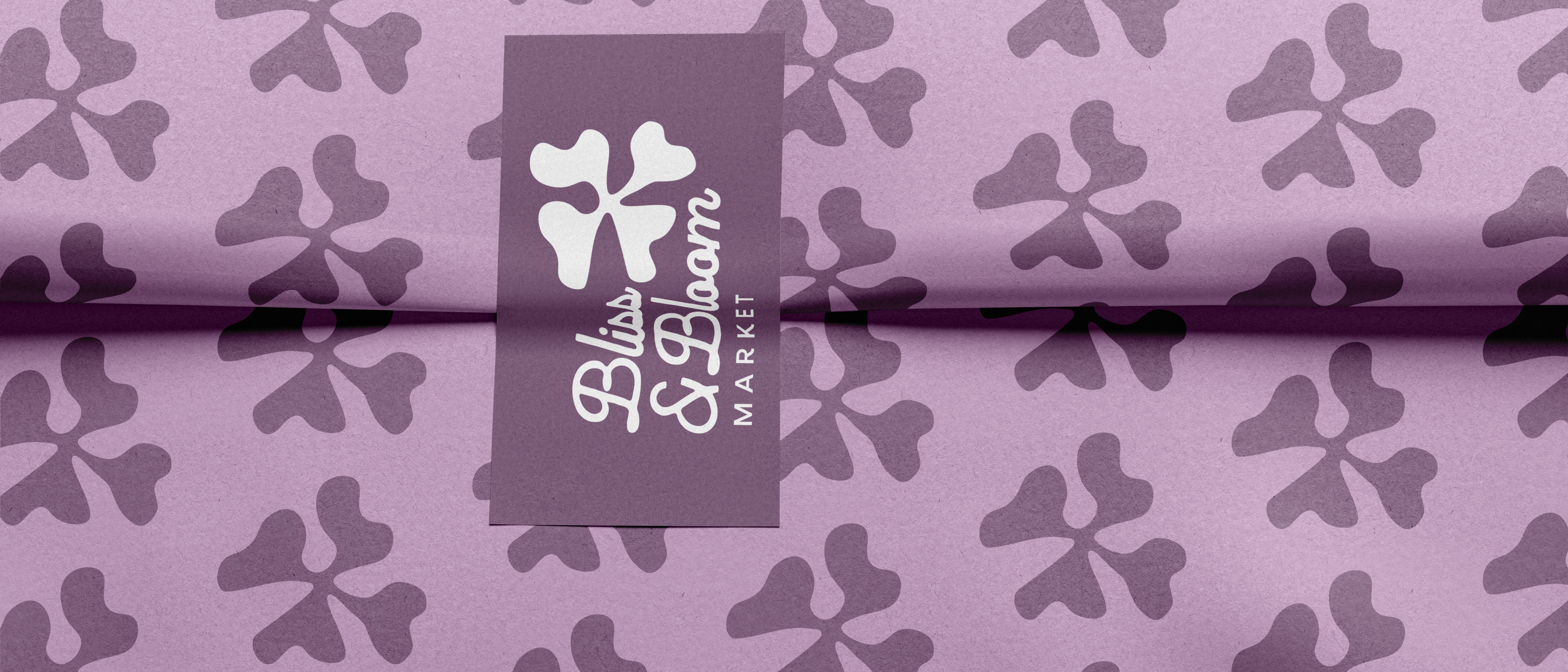
Front of business card
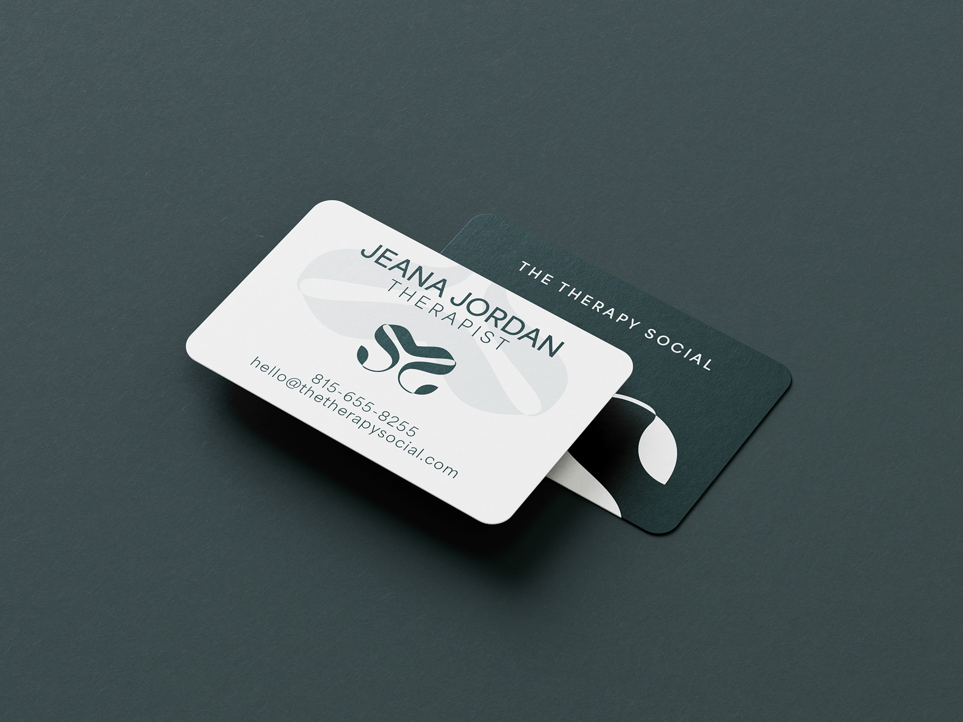
Back of business card
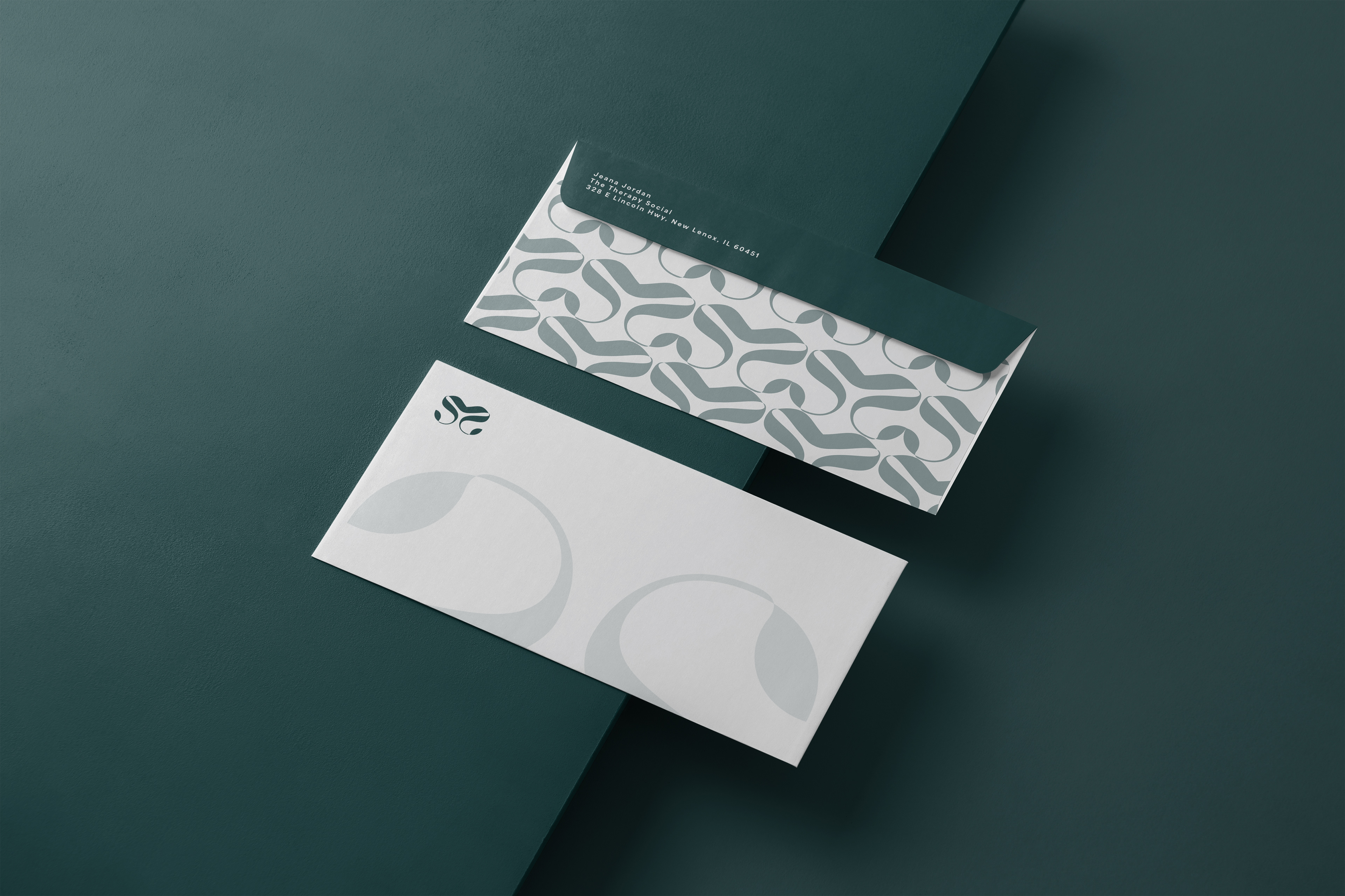
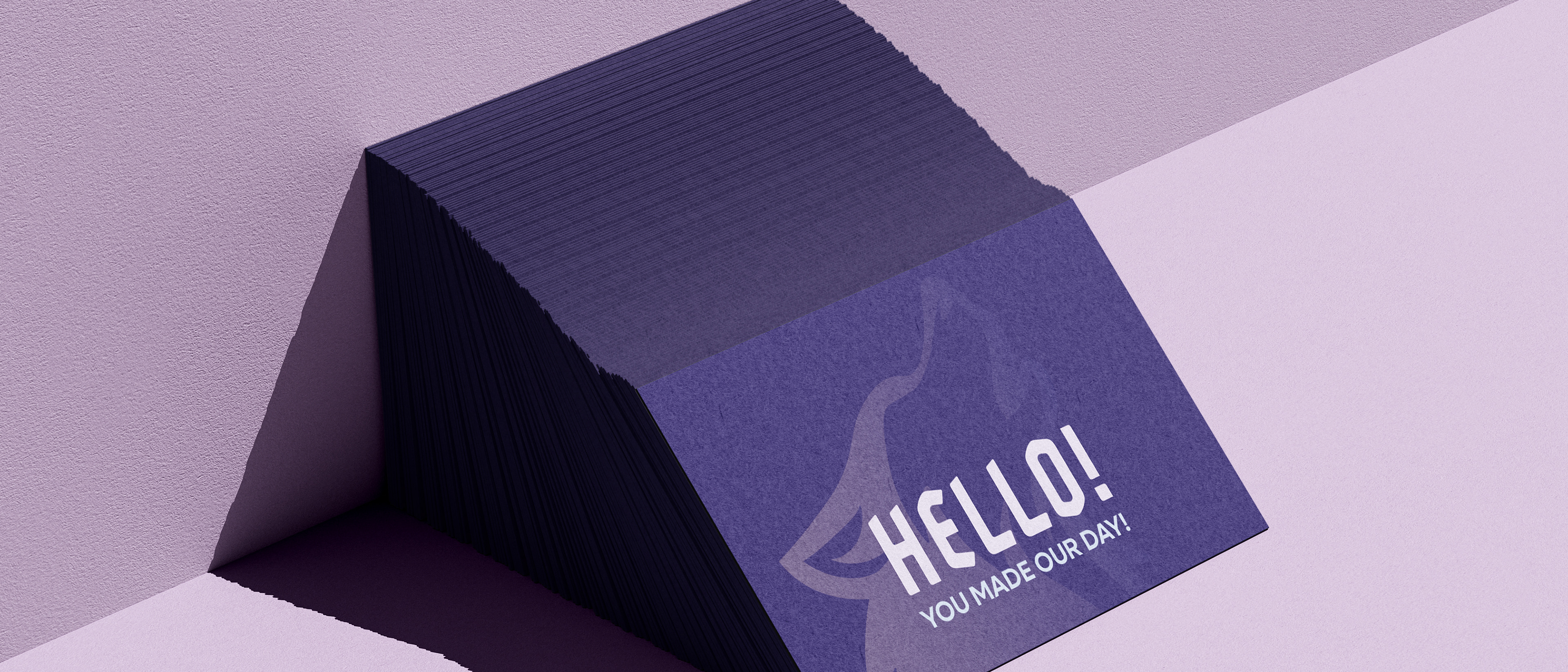
Envelope #10 design